Introduction
I am not a designer, and most business owners are not either. That is fine. But when I create a PDF for clients or leads, there is often that small pause. Does this look professional, or does it look rushed?
Designing a simple, professional PDF has very little to do with talent. It comes down to a handful of consistent decisions. Nothing fancy. Nothing complicated. Just deliberate choices.
In this article, I break down the core principles that make a PDF feel considered and credible, even if I am starting from scratch. I cover layout, typography, colour, and the small details that separate a polished document from one that feels messy.
I do not need expensive software. I do not need a designer on standby. I need clear structure and the discipline to keep things simple. That is usually the real work.
Key Takeaways
- Simplicity is the goal, not a compromise. A clean, uncluttered layout looks more professional than something overdesigned and busy.
- Consistency with fonts, colours, and spacing creates a sense of intention. It also makes the document easier to read, which is the point.
- White space is not wasted space. When I give content room to breathe, the whole document feels calmer and more organised.
- Alignment matters more than most people think. Lining elements up properly is one of the fastest ways to make a PDF look deliberate and well put together.
- Clear structure guides the reader. Strong headings and logical flow mean the content gets read instead of skimmed and forgotten.
If this feels like the piece you have been missing, I break it down step by step in the rest of the article.
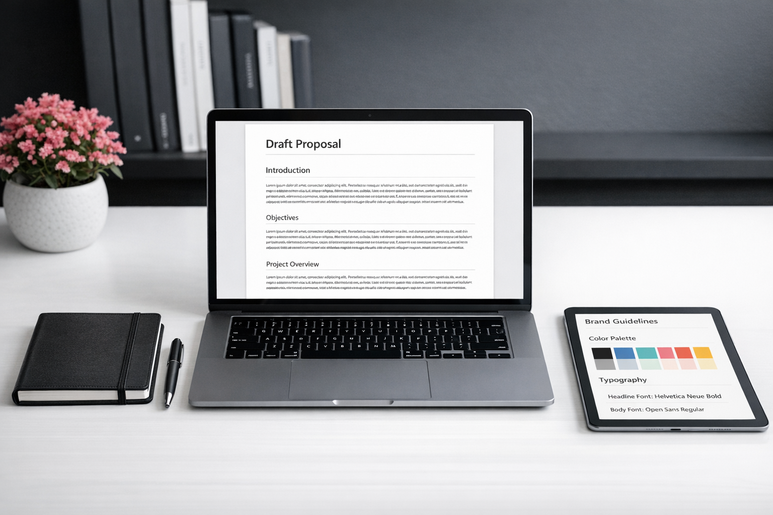
Single-Column Simplicity: Your Secret to Professional PDFs
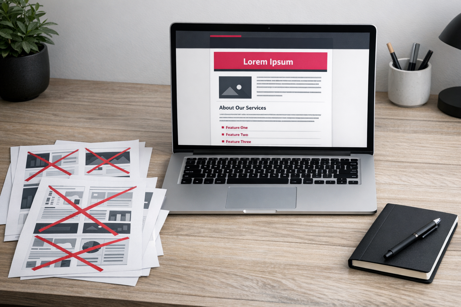
If you want a simple PDF that actually looks professional, the biggest upgrade you can make is this: stop trying to make it look fancy. I don’t know when we decided professional had to mean busy — multiple columns, decorative borders, icons everywhere — but it doesn’t. In fact, that’s usually what makes it look amateur.
Why a Single-Column Layout Works Every Time
A single-column layout keeps your reader moving in one direction: down the page. That’s it. No visual ping-pong. No “where am I meant to look next?” No weird text wrapping that behaves differently on every device. It’s one of the simplest PDF design tips out there — and honestly, one of the most ignored.
Clean layouts also print and export properly. And that matters. Your PDF might be opened on a phone, skimmed on a laptop, or printed on someone’s slightly tragic home printer. A single column handles all of that without collapsing in on itself. That alone is reason enough to keep things simple.
The other piece people miss is branding consistency in PDF design. Your fonts, colours and logo should match the rest of your world — your website, your emails, your social posts. When they line up, the PDF feels intentional. When they don’t… it feels like a last-minute add-on. And readers can tell.
You don’t need every brand colour you’ve ever chosen. Pick one or two. Use them consistently for headings and dividers. Leave the rest clean. White space is not wasted space — it’s breathing room. Visual hierarchy does most of the work anyway: larger text for headings, smaller for body copy, and nothing all shouting at the same volume.
Tools like Canva Docs make it easy to create professional PDFs because the layouts are already built around these basics. You’re not reinventing the wheel. You’re just applying your brand. That said, the tool isn’t the magic. The logic is: one column, consistent branding, no unnecessary clutter.
Have a look at the PDFs you’re currently sending out. Honestly. Do they look like your brand — or do they look like you were trying a bit too hard? Strip one back. Apply your brand properly. Keep it calm. See how much sharper it feels.
Harness Canva Docs for Effortless PDF Creation
If you’ve been putting off creating a simple, professional-looking PDF because you assumed you’d need design skills, a big budget, or yet another overcomplicated tool — pause. Canva Docs is worth an actual look. It lives inside the Canva platform you probably already use, but it’s built for documents, not social graphics. And that difference? It matters more than people realise.
Why Canva Docs Makes Branding Consistency Genuinely Easy
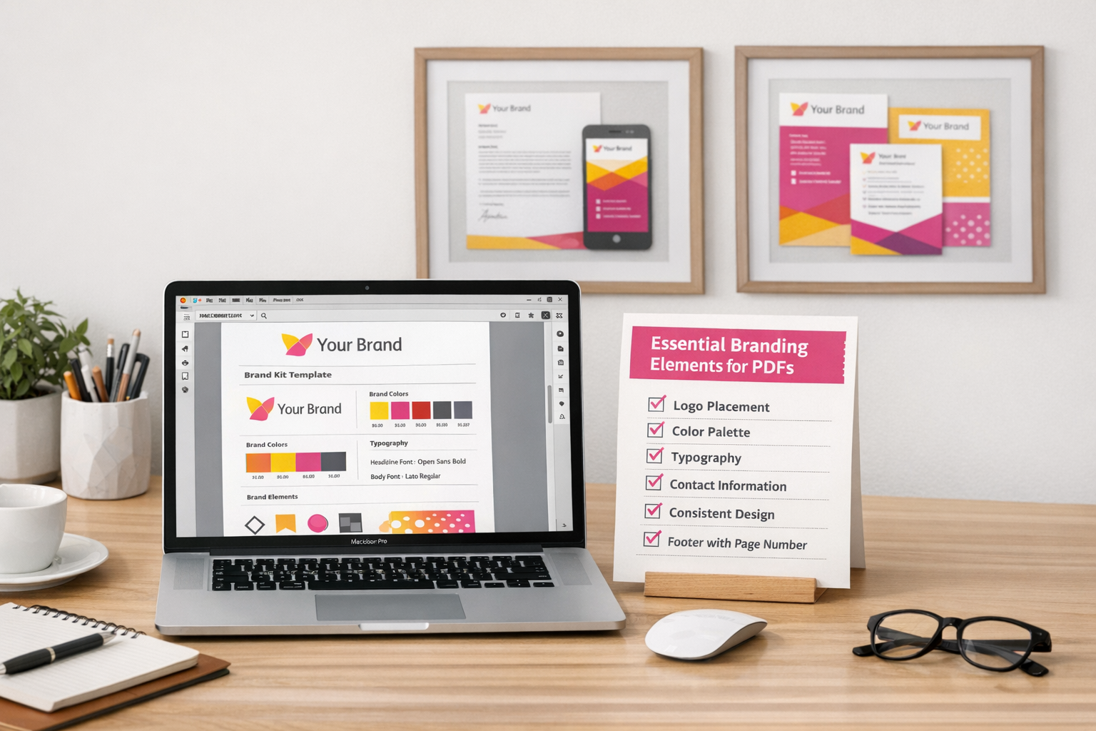
One of the biggest frustrations I hear about PDFs is that they end up looking… cobbled together. Random fonts. Slightly-off colours. Spacing that feels a bit chaotic. Canva Docs fixes a lot of that quietly in the background with its brand kit. Your colours, fonts and logo are already there. You’re not redesigning from scratch every time. You’re just getting the content in.
The drag-and-drop setup helps too. Adding tables, dividers or simple visual elements takes seconds. And those small structural details — a clean pricing table, a tidy divider between sections — do more heavy lifting than people think. They signal care. They make the document feel intentional, even if it took you half an hour on a Tuesday afternoon.
It also uses an endless scroll format, which feels far more natural when you’re drafting. You focus on writing first, then tidy the layout after. Which, honestly, is the right way round. So many business owners do the opposite — tweaking fonts before the message is even clear — and it often feels like that’s where the time disappears.
The templates are a solid starting point if you’re staring at a blank page. They’re not flashy. That’s the point. They’re clean, structured, and hard to break. If you want to create professional PDFs with Canva Docs without turning it into a three-hour design session, choose a template and replace the content. Done.
My suggestion: pick one small, real project — a simple welcome guide, a one-page service overview, or a client FAQ — and build it in Canva Docs this week. Not to “learn the tool”. Just to see if it actually fits how you work.

Keep It Consistent: The Fast Track to Professionalism
When you’re trying to design a simple PDF that actually looks professional, consistency is doing most of the heavy lifting. Not fancy layouts. Not clever design tricks. Just showing up the same way, every time. A mismatched font here, a random colour there, and suddenly your PDF looks like it’s been stitched together by three different people on three different days. It doesn’t take much.
Let Your Brand Kit Do the Work
Branding consistency in PDF design doesn’t need a graphic designer or some drawn‑out process. If you’re using something like Canva Docs, store your brand colours, fonts, and logo in a brand kit so they’re always one click away. Honestly, that one habit removes most of the decision-making — and most of the inconsistency — before you’ve even started.
The elements worth locking in are straightforward:
- Your primary and secondary brand colours
- One heading font and one body font (two is plenty)
- Your logo, ideally in a few format variations
- A simple colour or style for dividers and table headers
- Consistent spacing or margins throughout
None of this is groundbreaking. That’s kind of the point. It often feels like people overcomplicate branding when really, it’s just repetition. Steady. Predictable. The same choices, over and over.
Done Beats Perfect Every Time
The biggest enemy of a professional-looking PDF isn’t bad design — it’s endless tweaking. The nudging. The resizing. The “maybe this would look better slightly to the left” spiral. I think most business owners spend more time rearranging things than it would’ve taken to just send the thing and move on.
Static design decisions made once and reused consistently will always look more polished than a brand new layout you’ve agonised over but never quite finished. Always.
Treat your PDF template as a locked asset once it’s good enough. Simple PDF design tips don’t say this enough, but the fastest route to on‑brand consistency is deciding you’re done and resisting the urge to reopen the file unless something genuinely needs updating.
Professionalism reads as intentional. And “done” looks a lot more intentional than “almost ready.”
AI Tools: When and How to Use Them for PDFs
If you’re trying to design a simple PDF that looks professional without losing half a day dragging boxes around a screen, AI tools are worth a look. They’re not a gimmick anymore. Used properly, they cut the heavy lifting in half and get you to a solid draft much faster than staring at a blank page wondering where to start.
What AI Actually Does Well in PDF Creation
The honest answer? Structure. And copy scaffolding.
Tools like Claude are genuinely useful for building outlines, section headers, and chunks of body text you can drop into a template and shape. That’s the prompt-to-PDF workflow at its most practical. You’re not handing everything over. You’re just removing the blank-page paralysis and giving yourself something to work with.
Where it falls down is branding. AI doesn’t know your tone. It doesn’t know your colour palette. It definitely doesn’t know how you naturally explain things. It’ll give you something coherent, sure. But something that feels like you? Not without a proper review. And if you skip that step, it shows.
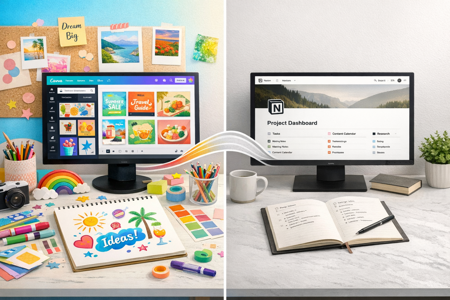
Notion vs. Canva: A Practical Comparison for AI-Assisted PDFs
Both platforms have gone all in on AI, but they’re solving different problems.
Canva’s AI is strong on formatting and layout suggestions. It’s helpful if you want to create professional PDFs with Canva Docs and don’t fancy designing every element from scratch. Notion’s AI is better at structured written content. Cleaner thinking. Better first drafts. But its PDF export has, historically, felt a bit clunky. Functional, not beautiful.
The sensible move is to combine them when it makes sense. Generate and structure in one place. Design and export in another. That’s not overcomplicating it. That’s just using tools for what they’re actually good at.
AI-generated layouts are fine to test, but treat the first output as a starting point. Not a finished file. Before you export, run through a quick sense check:
- Does the structure actually match what your reader needs?
- Does the tone sound like you, or like a polite robot?
- Are fonts, colours, and spacing consistent with your brand?
- Have you stripped out any filler that doesn’t earn its place?
If you’re dipping your toe in, start small. A one-page resource. A checklist. A short FAQ. Run it through an AI tool, review it properly, and see whether it genuinely saves you time. Simple PDF design tips tend to travel better than complicated ones. I think that’s true with AI as well. Keep it clean. Keep it useful. Then decide if it deserves a bigger role.

Choosing the Right Tool: Canva vs. Notion for PDF Design
When you’re creating a simple PDF that still needs to look professional, the decision that actually matters is the tool. Pick the wrong one and you’ll spend twice as long wrestling buttons and layouts instead of just getting the thing done. It’s frustrating, and honestly, unnecessary.
For most small business owners, it really comes down to two options: Canva or Notion. That’s it. You don’t need a stack of software to make a decent PDF.
What Canva Does Well
Canva is the obvious choice when your PDF needs to look polished straight away — lead magnets, pricing guides, client-facing documents where branding actually matters. If it’s going out into the world with your name on it, design counts.
You get drag-and-drop control over layout, fonts, colours, imagery — the whole thing. You can create professional PDFs in Canva Docs without a design background, and it will still look considered. If visual presentation is the priority, Canva is usually the straightforward answer.
But it’s not perfect. Canva isn’t built for documents you’re constantly tweaking or rebuilding. Once something’s designed, major structural edits can feel fiddly. You can do it, obviously, but it’s not always smooth if the content keeps shifting.
Where Notion Fits Instead
Notion makes more sense when your PDF is more about structure than style — SOPs, internal guides, resource lists. Things that need to be clear and easy to update, not necessarily pretty.
It handles tables, dividers, and clean formatting well. You can rearrange sections without breaking everything. And if you’re already drafting inside Notion, exporting is simple. There are also AI tools connected to Notion that can speed up drafting, which is useful if you’re pulling together information quickly.
The compromise? The export styling is minimal. It’s clean and readable, yes. But it won’t have the visual weight or branded feel of a Canva design. It just won’t.
Here’s the simplest way to decide:
- Choose Canva if your PDF is client-facing, brand-led, or needs to look designed
- Choose Notion if your PDF is internal, text-heavy, or needs frequent updating
- Use Canva for one-off documents; use Notion for living documents you’ll revisit
- Consider Notion if you’re already using it as part of your wider workflow
Before you choose, pause for a second. What does this PDF actually need to do? Impress, inform, or instruct?
I think we overcomplicate this part because tools feel important. They are — but only in context. Once you’re clear on the job the document is doing, the software choice becomes obvious. And you stop turning a simple task into a tech decision spiral.
Sources:
Notion vs. Canva (2026)
Related posts you might find helpful: