What to Put on a Thank You Page (So People Take Next Steps)
I see thank you pages all the time that say “Check your inbox” and nothing else. It is treated like a polite full stop. Transaction done. Conversation over.
In fact, I think that is wasted space.
When someone has just signed up, downloaded your lead magnet, or bought from you, they are paying attention. They have momentum. That moment is one of the cleanest marketing opportunities you get. They have already said yes to something. They are open to what comes next.
Knowing what to put on a thank you page that actually converts is not about cramming in links or squeezing in a hard sell. It is about understanding where someone is in their journey and offering a logical next step. One step. Something that makes sense. Something that keeps things moving.
In this article, I break down the essential elements of effective thank you pages, why they work from a psychology point of view, and practical examples you can use straight away, without building a messy, overcomplicated tech setup.
Key Takeaways
- Thank you pages are active conversion opportunities, not just confirmation screens. I use them to capture people at their most engaged and receptive moment.
- The most effective thank you pages follow a simple formula: acknowledge the action, give clear instructions, and offer ONE valuable next step.
- Your next step CTA should be strategic. I choose options like booking a call, offering a low-ticket product, or running a quick survey based on the specific goal I am working towards.
- Personality matters. A little humanity on a thank you page builds connection and makes the next step feel natural instead of forced.
- Keep your tech stack streamlined. Overly complex integrations create fragile systems that are harder to maintain and even harder to improve over time.
Read on to turn those “thanks, bye” moments into meaningful steps forward in your customer journey.
What to Put on a Thank You Page (So People Take Next Steps)
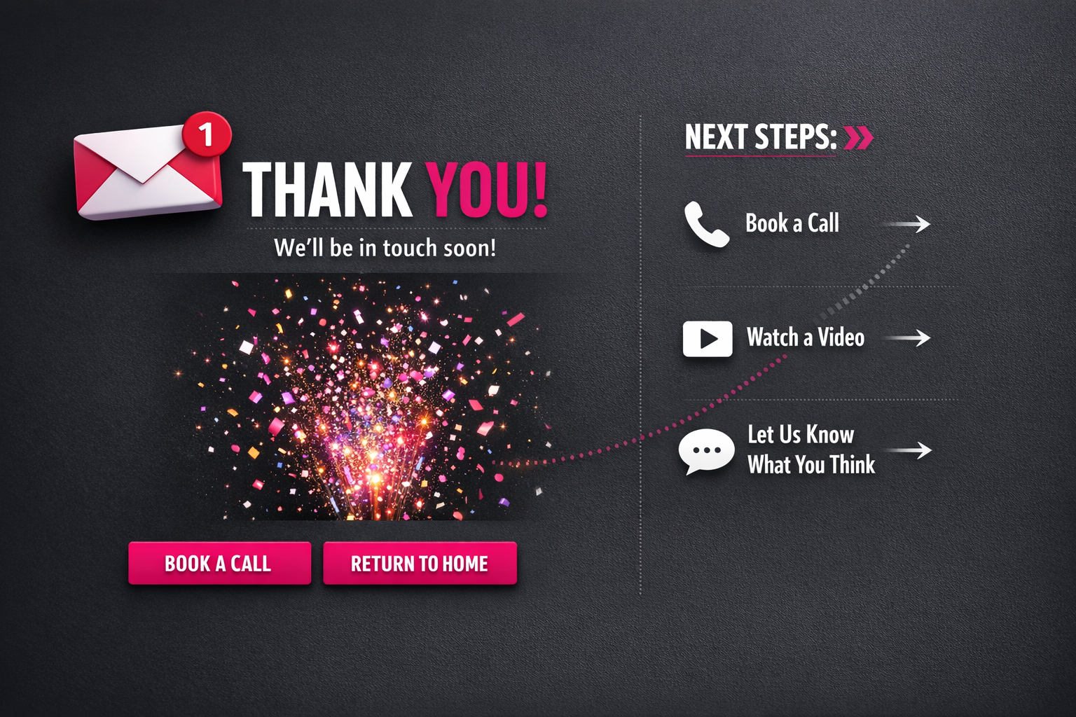
Let’s be honest – most thank you pages are a total waste. You’ve finally got someone to sign up, buy, or download… and then what? “Check your inbox.” End of energy. Done.
But what you put on a thank you page actually matters. A lot. This isn’t a polite full stop. It’s a live moment.
When someone lands there, they’ve just taken action. They’re switched on. They trust you enough to hand over their email or their money. That’s not small. That’s exactly when they’re most open to the next suggestion. Ignore that and you’re leaving momentum on the table.
Strategic Elements for an Effective Thank You Page
The best thank you pages don’t just confirm what happened. They guide what happens next. Calmly. Clearly. No drama.
Here’s what’s worth including:
- A clear confirmation message (obviously)
- Next-step instructions (what to expect and when)
- Social sharing options for the offer they just claimed
- A relevant secondary offer or upgrade
- Social proof showing others who’ve taken this journey
- Contact information or support options
- A navigation path back to valuable content
Of course, that doesn’t mean throw all of it on there at once and hope for the best.
The strategy isn’t “add more”. It’s understanding where this person is right now and giving them the next step that actually makes sense. Not five options. Not a random offer you’ve been meaning to push. The right next step.
Your thank you page should feel like a continuation of the decision they just made. Not you scrambling to squeeze extra value out of them because you’ve got their attention for three more seconds. There’s a difference. People can feel it.
I’ve seen businesses increase overall conversion rates by 15–25% just by improving what they put on this one page. Same traffic. Same offers. Just better use of the moment. That’s real revenue from space most people ignore.
And different thank you page ideas work for different models. An ecommerce brand might lean into cross-sells. A content-led business might focus on community or getting people deeper into the content. It depends. The point is, it should fit the journey they’re already on.
The best practices for thank you pages all have one thing in common: they respect the visitor’s mindset. No sharp turns, no weird pivots, no unrelated pitch because “why not”.
Just a thoughtful nudge forward. That’s it.

How to use a thank you page for conversions
The most overlooked opportunity in your entire marketing funnel? Those few seconds after someone submits their email. That’s when they’re actually paying attention.
This is what to put on a thank you page that converts: not a polite little “thanks, bye” and nothing else, but a clear step forward. They’ve just opted in. Their mind is open. They’re waiting. You’ve got a small window where they’re actively engaged — and most businesses waste it.
Surprisingly, it feels like such a basic thing — and yet it’s constantly missed.
The 3-part thank you page formula
“Check your email” is necessary. It is not a strategy.
Yes, tell them to confirm or grab the PDF. Obviously. But if that’s all your thank you page does, you’re leaving momentum on the table. This is how to structure it instead:
- Acknowledge their action (“Thanks for downloading my guide!”)
- Direct them to their inbox (“Check your email for the PDF”)
- Offer ONE clear, valuable next step
Crucially, that third part is where things usually fall apart. Someone has just raised their hand and said, “I’m interested.” So give them something useful to do while they’re still in it.
Not five options. Not your whole website. One step. And ideally, make sure that next step actually connects to your follow-up system properly — page, confirmation, automation and CRM talking to each other — so the momentum doesn’t quietly break behind the scenes.
What makes an effective next step?
The best thank you pages create a natural bridge between the free thing they just grabbed and the paid thing (or deeper step) you actually care about.
You’re maintaining momentum. That’s it. You’re not trying to cram your entire business into one page.
Options that tend to work well:
- A short video that builds on the lead magnet
- A limited-time discount on your entry product
- An invitation to book a discovery call
- A single-question survey to segment them
- Access to a relevant community or resource library
I’ve seen conversion rates shift just from adding one focused call to action that lines up with what the subscriber actually wants next. Not flashy. Not complicated.
It’s rarely about design. It’s about logic.
Does this next step make sense, feel like the obvious progression, and genuinely help them while moving your business forward at the same time?
If yes, you’re doing it right. If it feels random or crowded, it probably is.

What to Actually Include on a Thank You Page (With Personality)
Wondering what to put on a thank you page that actually gets people to take the next step? Let’s stop overcomplicating it. This page has one job: confirm what just happened, make the person feel good about it, and guide them forward. That’s it. No robotic waffle. No corporate autopilot.
Confirmation that builds confidence
First things first: people need to know it worked. They clicked, signed up, and paid. Whatever it was — it went through.
Please don’t say, “Your form has been submitted.” No one talks like that. Say something human — try “You’re in”, “Got it”, or “We’ve got your message.” Keep it simple, clear, and human.
Then tell them what happens next — properly. Not “keep an eye on your inbox” and hope for the best. Be specific. “Check your inbox in the next 5 minutes for your welcome email with your download link.” Specific builds trust. Vague just creates doubt, and I think a lot of thank you pages accidentally leave people hovering, unsure if they need to do something else.
Clarity here reduces confusion and second‑guessing. And when people feel confident, they stick around.
Personality touches that create connection
Here’s where it gets interesting.
Your thank you page is one of the few places where someone has actively just said yes to you. That’s not small. So why act like a bank receipt?
Add something human — a relevant GIF, a quick Loom video saying hello, or a behind‑the‑scenes peek. It doesn’t need to be groundbreaking. It just needs to feel real.
This is where thank you page ideas actually matter — when they sound like you. If you’re slightly sarcastic, let that show. When you’re encouraging by nature, encourage. For the thoughtful and curious, own that too. Don’t flatten yourself into beige because it feels “professional”.
People buy from people. We all know that. But I think we forget that connection is often built in tiny moments, not huge gestures. A bit of personality before your main call‑to‑action can make that next step feel natural instead of pushy.
The essential elements every thank you page needs
Here are the non-negotiables. No fluff. Just what works:
- Clear confirmation message with personality
- Specific next steps (what to expect and when)
- Contact information if they have questions
- A primary call-to-action that guides their next interaction
- At least one personality element that differentiates you
That’s it.
What you don’t need? Generic stock photos. Recycled landing page copy pasted again. A maze of navigation options that sends people wandering off.
Your thank you page strategy — if we’re calling it a strategy — should be simple and directional. One clear moment. One clear next step.
The best thank you pages feel like a warm “you’re in” rather than a cold receipt. They move people forward without pressure. They make someone feel acknowledged. Seen. And ready for what’s next, instead of slightly unsure.
And honestly? That’s more than most businesses manage to do.

What’s the Real Next Step You Want Them to Take?
Let’s be honest about what to put on a thank you page: that shiny PDF guide you promised? Most people won’t read it. I know — you spent ages creating it. But if your whole funnel relies on them sitting down with a brew and consuming that lead magnet cover to cover, you’ve already built this on shaky ground.
Instead, use this moment — when their attention is actually with you — to guide them to one clear, low-friction next step. They’ve just handed over their email. That’s not small. Don’t waste it.
Choose a Micro-Commitment That Builds Momentum
The smartest thank you pages aren’t about delivering information. They’re about building momentum. I think that’s where people get it wrong. They treat it like a delivery page. It’s not. It’s a springboard.
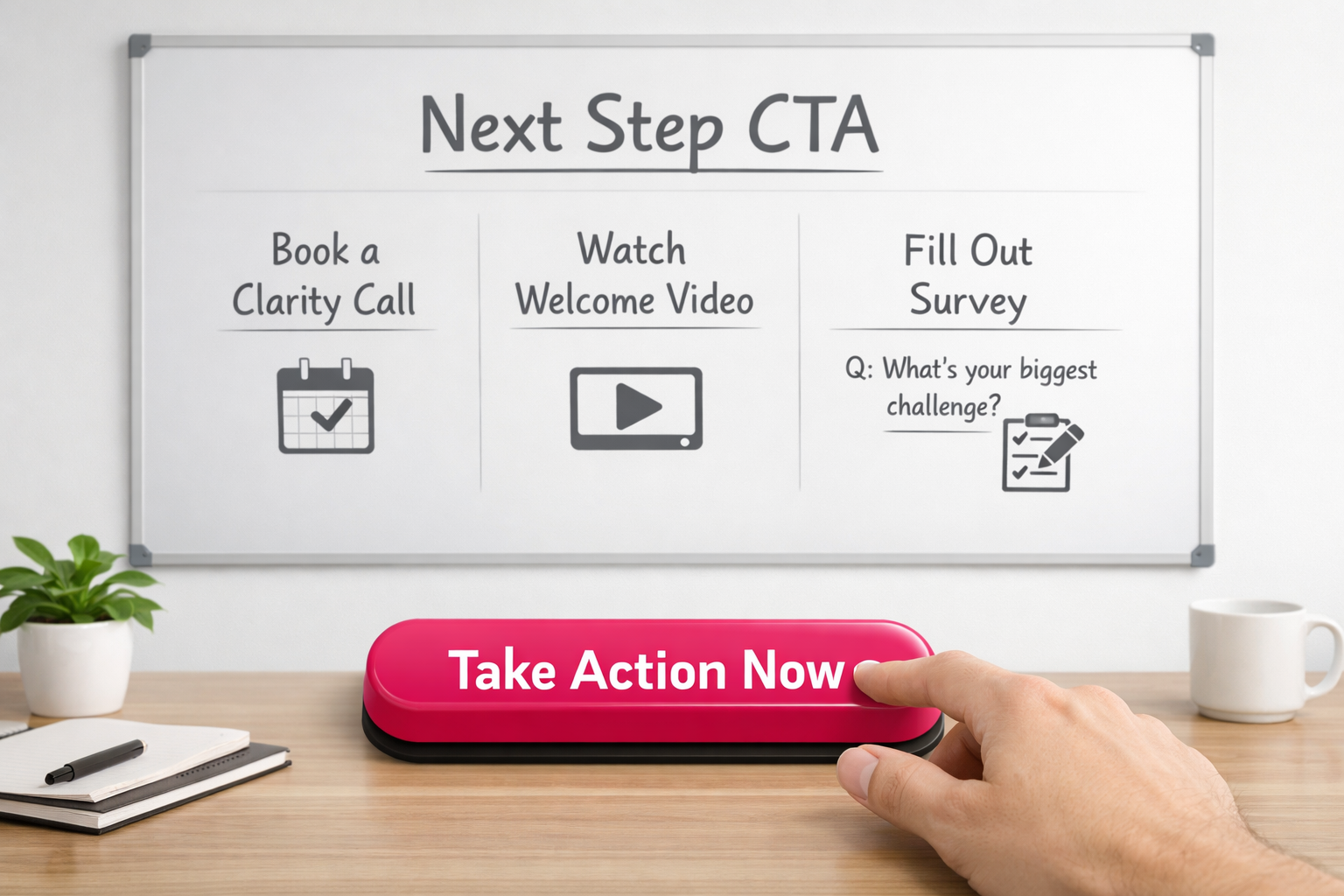
Here are strong next steps you can include:
- Book a short clarity call (Calendly or similar makes it easy)
- Watch a welcome video under 2 minutes (Loom is perfect for this)
- Answer one simple question to help you segment them (Tally or Typeform works well)
- Join your community in a single click
- Follow you on their preferred social platform via a direct link
That’s it. One action. Make that call to action the star of the page. Impossible to miss. Be explicit about the benefit — answer the “what’s in it for me?” without waffling.
I’ve found thank you pages work best when they give people traction, not homework. The download link should absolutely be there — you promised it. But treat it like a resource they can come back to, not the headline act.
Moreover, placement matters more than people think. Put the CTA above the fold. Make it visually obvious. Strip out anything that competes with it. No clutter, no mixed messages.
Ultimately, this page sits in a critical moment. They’ve just moved from stranger to subscriber. That shift is small but significant. Guide them into the next meaningful interaction while the energy’s still there — before it fades.
Example Thank You Page CTAs That Actually Work
When you’re deciding what goes on a thank you page, the CTAs (calls to action) are the bit that actually matters. This isn’t about sticking a random button at the bottom and hoping for the best. It’s about choosing a deliberate next step for someone who has just said “yes” to you.
They’ve opted in. They’re paying attention. That’s not small.
Choose CTAs That Match Your Business Goals
Your thank you page CTAs should support what you’re actually trying to achieve in your business. Not what you think you should put there. What you genuinely need next.
Here are three options that consistently work across different models:
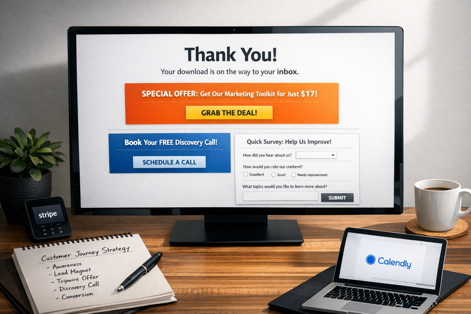
- Book a discovery call – Ideal if your business relies on consultation or you need some level of qualification before selling. A straightforward booking link here can turn a casual lead into a real sales conversation while interest is still high — especially when the confirmation, reminders and CRM are connected behind the scenes. This is often the cleanest next step.
- Offer a low-ticket “tripwire” product – A £27 digital guide or £47 mini-course that directly relates to what they’ve just signed up for can bring in immediate revenue. These smaller offers let people step into your paid world without a huge commitment. It’s simple. Low risk. Clear value.
- Request a quick 3-question survey – This helps you segment properly and gives you insight into who’s just joined your list. Thank you page surveys often convert far better than when you try the same thing over email later. People are already there. It feels easier to answer now than “someday”.
One CTA, one clear purpose
The most effective thank you page strategy is actually very straightforward: if the CTA either moves someone closer to paying you or helps you understand them more clearly, it belongs there. If it doesn’t, it’s probably just noise.
And I’ll say this plainly — your thank you page is prime real estate. Someone has just taken action. They’re engaged. Receptive. Don’t waste that moment on social media icons or a bland “thanks for signing up” that goes nowhere. It often feels like such a missed opportunity.
Tools that unify payments, booking, CRM and automation make adding a tripwire or survey far easier to manage long term, because you’re not patching together five different systems just to track what someone did next. It doesn’t need to be complicated to work — but it does need to be connected.
Whatever you include on your thank you page should serve a clear purpose in your wider conversion path. Choose one main CTA that aligns with what your business actually needs next. Not five options, not three competing ones — just the next logical step.
Keep your tools streamlined (or this will feel 10x harder)
Deciding what to put on a thank you page should not feel like building a spacecraft. And yet… I see so many business owners tying themselves in knots, connecting five different apps just to send a confirmation, trigger a follow-up, segment the lead and maybe sell a small offer. It’s a simple post-purchase moment. It does not need a systems engineer.
As a result, all that complexity creates a fragile tech stack. One platform updates something, an integration breaks, and suddenly your “simple” automation stops working. Now you’re troubleshooting instead of actually running your business. It often feels like we’ve been told this kind of complexity is just normal. I don’t think it is.
Choose integration over fragmentation
Your thank you page strategy will fall apart if keeping it live becomes a technical headache. If it’s painful to maintain, you won’t optimise it. You’ll avoid it.
So, consolidate where you can:
- Platform options that reduce integration headaches:
- All-in-one solutions like GoHighLevel that handle page building, CRM tracking, bookings, payments, and follow-ups in one place — so your thank you page, next step and automation actually live inside the same system
- Simpler combinations like Leadpages connected to your email platform
- Form tools with built-in thank you logic (Tally.so, Typeform)
- Calendar tools that integrate confirmation pages (Calendly)
When you’re deciding what to include on a thank you page, your tech either supports your thinking or gets in the way of it. I’ve watched smart strategies slowly get abandoned, not because they were bad ideas, but because maintaining them became too much of a faff. That’s not a strategy problem. It’s a systems problem.
Let strategy drive tech (not vice versa)
This is where a lot of people get stuck. We build thank you pages around what our tools allow, instead of what our customers actually need next. Backwards.
Therefore, your tools should support your conversion goals. Not dictate them.
If your platform makes it hard to include dynamic content, personalise the next step, automatically segment people based on their click, or trigger the right follow-up without Zapier gymnastics, that’s a red flag. The best thank you page ideas usually come from watching what customers do and tweaking fast. You cannot do that easily when everything is stitched together with digital duct tape.
That’s why I’m such a fan of reducing the stack altogether. Using something like GoHighLevel means your pages, pipelines, automations, booking flows and contact records sit in one place. When someone opts in, books, buys or answers a survey, the system already knows — and can move them to the right next step without you manually connecting dots.
And every extra tool? It adds friction. For you, in management and maintenance. For your customers, if anything loads slowly or breaks.
When your tech stack is streamlined, you spend less time fixing things. More time refining what actually goes on your thank you page. That’s where the gains are. Not in adding another app.

Sources:
“2025 Digital Experience Benchmark” (Contentsquare, 2025)