Why Your Social Posts Don’t Look Consistent (Even If You Post)
You’re posting regularly. You’re showing up. You’re doing the work. And yet your social feed looks like five different people have taken turns running it.
That disconnect can feel irritating. You know you’re consistent with effort, so why doesn’t it look consistent? I see this all the time. It’s rarely about commitment. It’s almost always about visual clarity.
When your content shifts in style every few posts, people have to reorient themselves each time. It’s subtle, but it matters. Recognition gets lost. Trust takes longer to build. And your brand ends up working harder than it needs to.
In this article, I’m breaking down why your posts don’t look cohesive even when you’re posting regularly, and how that visual noise chips away at your impact. I’ll also walk you through simple systems that create consistency without hours of tweaking in Canva or paying a designer to fix it for you.
Key Takeaways
- Visual inconsistency forces your audience to “meet you for the first time” over and over again, which makes your brand harder to remember and harder to trust.
- Decision fatigue is usually behind the inconsistency. When you create every post from scratch, you drain your energy and default to random design choices.
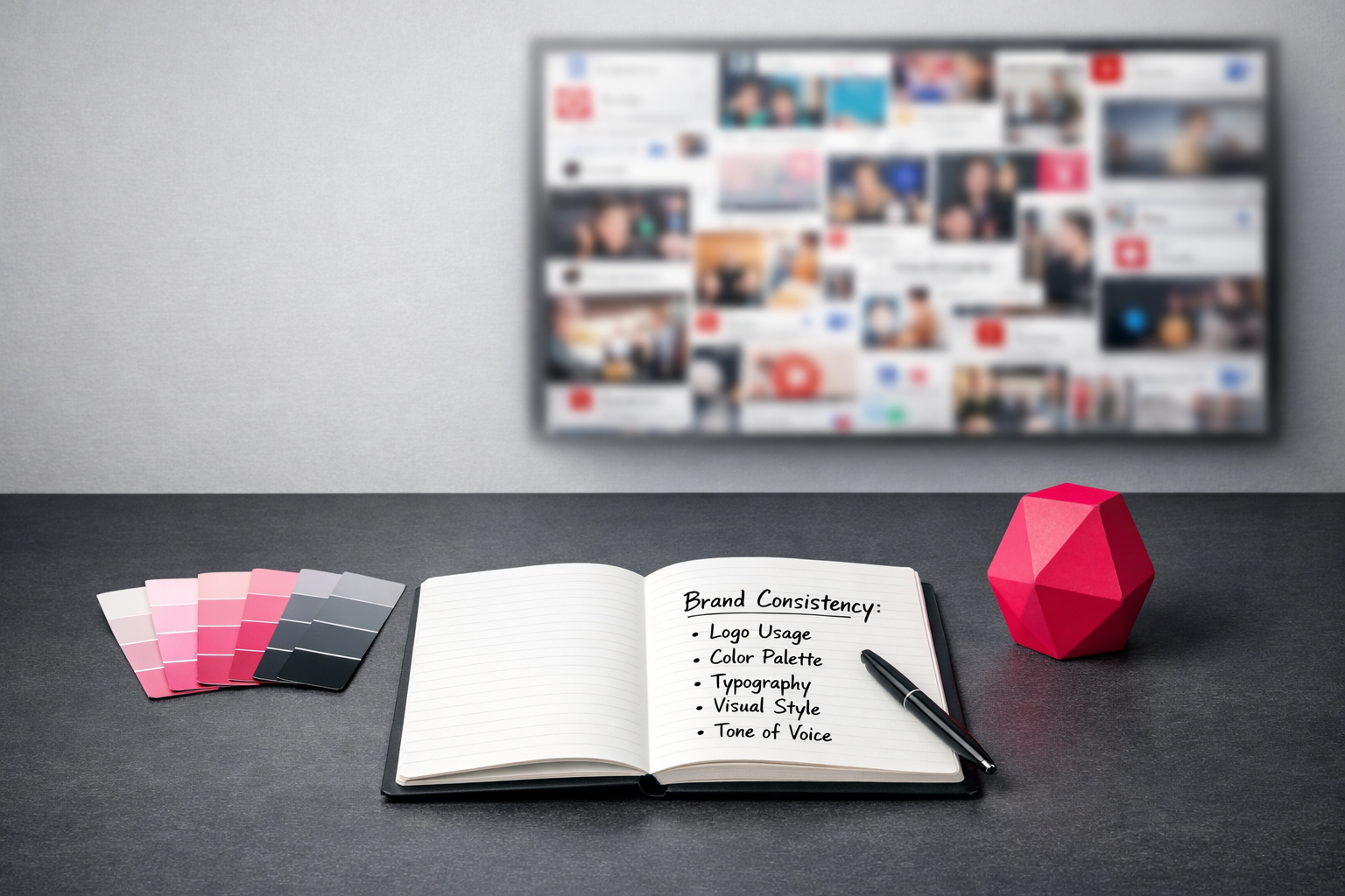
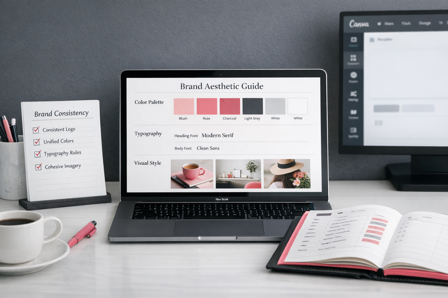
- A simple brand aesthetic guide with defined colours, fonts, and styling rules removes guesswork and builds recognition.
- Video is often where consistency falls apart most. Standardise your captions, intros, and filters so your clips feel connected.
- The goal is not prettier posts. The goal is faster trust. When someone recognises your content before they see your name, your branding is doing its job.
If you’re ready to shift your feed from scattered to cohesive, I’ll show you the systems that make your brand recognisable at a glance.
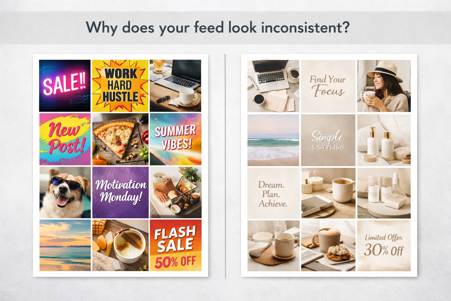
You’re showing up—but your feed looks like 5 different people made it
Let’s just say it. You’re showing up, posting, and doing the work. So why does your social feed look like five different people took turns running it?
This is the bit that frustrates people. The issue isn’t effort. It’s not dedication. It’s cohesion.
I see this constantly. Smart business owners creating solid content, engaging properly, turning up consistently… and then you land on their profile and it looks like a visual car boot sale. Every post doing its own thing. No thread, no flow, no sense that it all belongs together.
The trust-killer nobody talks about
In fact, inconsistent branding quietly chips away at trust. You can be brilliantly consistent with posting, but if your visuals are all over the place, it weakens the impact.
When someone lands on your profile and sees chaos, they hesitate. Even if your content is strong. Even if your message is clear. Something feels off.
And I think this is the bit people underestimate: every random visual choice forces your audience to reprocess you from scratch. They’re meeting you for the “first time” again and again. There’s no instant recognition. No mental shortcut. No “oh yes, that’s her”.
If your Instagram feed looks off despite your effort, this is usually why. People need visual cues. Familiarity. Signals that say, this is who I am, this is what I stand for.
Without that, you’re harder to remember.
Consistency is your secret recognition weapon
Your brand should feel like you everywhere. Same tone, same style, same energy. Not identical posts — just recognisable.
When someone can clock your content mid-scroll without seeing your name, that’s when branding is doing its job.
Ask yourself:
- Are your colours actually a palette, or are you choosing whatever suits your mood that day?
- Do your fonts stay consistent, or are you hopping between templates because they looked nice at the time?
- Do your images share similar lighting or composition, or is it a complete mix?
- If someone read three captions back-to-back, would they clearly hear your voice?
The brands you instantly recognise — even in a tiny thumbnail — aren’t accidentally consistent. They’ve decided who they are visually and stuck to it.
And no, that doesn’t make them boring. It makes them memorable.
Go and look at your last nine posts. Properly look at them. Do they feel like they came from the same person? Would someone new assume they belong to one brand?
If not, don’t spiral. This is fixable. In the next section, I’ll show you how to tighten this up without driving yourself mad or hiring a designer.
Visual consistency starts with fewer choices, not more options
Ever wonder why your social posts don’t look consistent, even though you’re showing up regularly? It’s usually not effort. It’s overthinking. Most business owners build every post from scratch, tweaking colours and fonts each time, and slowly draining all their decision-making energy before they’ve even written the caption.
Decision fatigue is killing your brand aesthetic
It’s not that you can’t design. It’s not that you need fancier tools. You’re just making too many choices. Fonts, colours, layouts, graphics — over and over again. Inconsistency isn’t bad luck at that point. It’s inevitable.
Every design decision costs you. By the fourth post of the week, you’re not choosing the same way you did on Monday. You’re tired. You rush. You “try something different”. And that’s exactly how feeds end up looking like five different brands in one. If you want to know how to make your social media look consistent, it starts here — stop treating every post like a brand new design project.
There’s also something sneaky that happens. When everything feels open and flexible, it feels creative. But it’s chaotic. And I think a lot of business owners mistake freedom for flexibility, when actually what they need is structure.
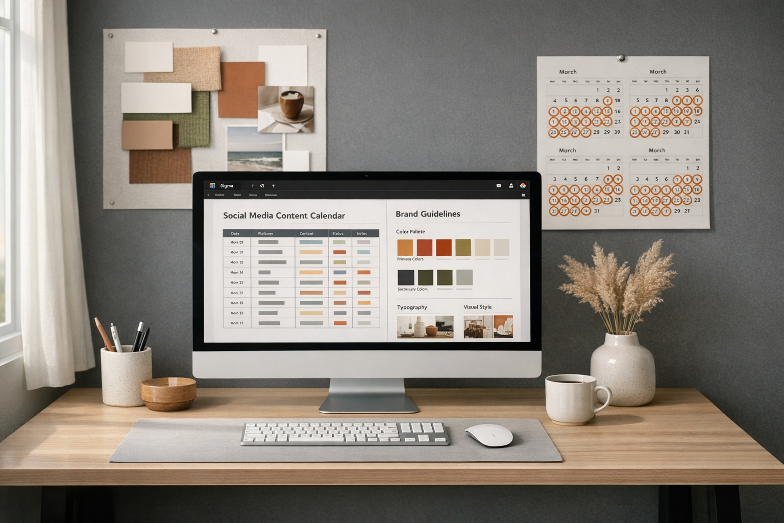
Create a brand aesthetic guide that eliminates questions
Set your brand elements once. Then stick to them. Properly. That means exact hex codes (not “kind of that blue”), specific fonts (not “whatever looks good today”), and clear styling rules for images.
A solid brand aesthetic guide for creators doesn’t need to be complicated. It just needs to remove questions. It should answer:
- What are my exact brand colours? (Primary, secondary, accent)
- Which 2–3 fonts do I use, and where?
- What visual style do my images follow? (Bright, moody, minimal, colourful)
- What elements stay consistent? (Logo placement, text blocks, borders)
- What’s absolutely NOT part of my brand?
That last one matters more than people think.
Tools like Canva’s Brand Kit let you lock these in so they’re always there. Store the full guide in Asana or Notion so you’re not relying on memory mid-design.
Consistency isn’t about making everything identical. It’s about coherence. Your audience should recognise your content before they even clock your name. And when you’re tempted to switch it up, pause and ask: is this actually aligned, or am I just bored?
If you don’t have a proper Brand Aesthetic Guide yet — or yours lives half in your head and half in random folders — now’s probably the time to sort it. Keep it simple. Make it specific. Actually use it.
People will feel the difference before they can explain it. And that’s the whole point.
Why design tweaks drain your marketing momentum
Let’s be honest: every time you open Canva and start from scratch, you’re not “just making a post”. You’re quietly messing with your own marketing system.
That blank canvas feels creative. Freeing, even. But more often than not, it’s a consistency killer. And consistency is the invisible engine behind a recognisable brand.
Those “just five more minutes” adjusting fonts, trying another colour, nudging things left then right? Not harmless. They’re momentum vampires. They eat your time and they slowly blur your brand at the same time. It feels productive. It isn’t.
The hidden cost of visual inconsistency
Have you ever scrolled someone’s Instagram and thought, something’s off here… but you couldn’t quite explain it? That slight friction? That’s inconsistency.
And it’s costing you. Followers. Engagement. Sales.
When your content looks different every time, people have to work to recognise you. Every post stands alone instead of building on the last. There’s no thread. No visual memory. Just noise.
Clean, cohesive feeds convert better because the brain doesn’t have to keep recalibrating. It recognises, relaxes, and listens.
Could a stranger recognise your brand after scrolling your last six posts? If the answer’s “probably not” — that’s the trap.
Sometimes it’s not dramatic. It’s subtle. A shift in colours, a random new font, a layout you tried once and then never again. But collectively? It chips away at recognition.
Building systems that preserve momentum
The fix isn’t more design. It’s better systems. Less reinventing, more reusing.
Here’s how to get out of the cycle:
- Turn your best designs into templates in Canva instead of starting fresh each time
- Create a simple brand folder in Notion with visual examples, not just hex codes
- Set a recurring 30-minute weekly slot to batch-create posts using your templates
- Limit yourself to 2–3 layout variations total (not per week)
- Choose a consistent filter or editing style for photos and stick with it
Brand consistency isn’t about being pretty. It’s about cognitive ease. When your visuals are consistent, you remove friction between your audience and your message.
I’ve seen businesses shift their engagement simply by becoming visually predictable. Not dull. Predictable.
There’s a difference between someone seeing your post and thinking, “Who’s this?” and thinking, “Oh—it’s them again.”
You want the second one. Every time.
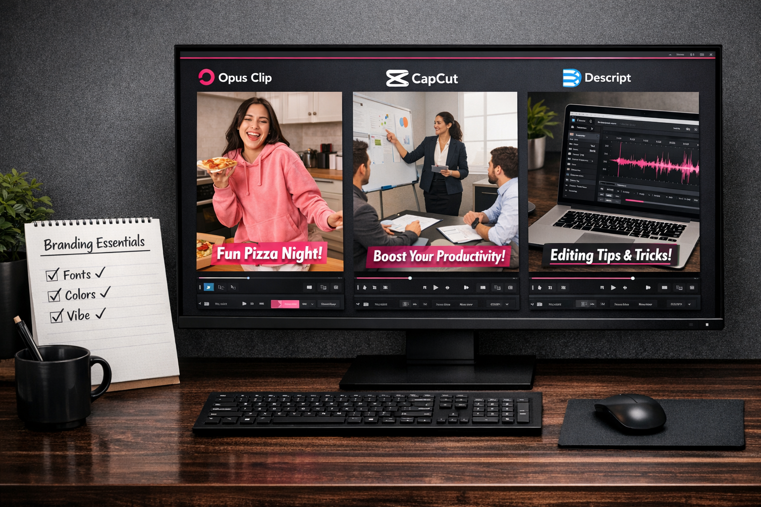
Your videos need this too (or they break the whole vibe)
Let’s just say it: video is usually where the whole brand falls apart. If your social posts don’t look consistent, nine times out of ten it’s because video branding’s been ignored. We’ll obsess over fonts and colour palettes for our graphics… then throw a completely different style at every Reel. And in video, inconsistency is loud.
Short-form video makes this worse. You’ve got seconds. That’s it. People shouldn’t be using those seconds figuring out whether you’re the same person they watched yesterday. The recognition needs to be instant. No thinking required. And if you’re manually editing every single clip from scratch, re-deciding captions and layouts each time, you’re almost guaranteeing inconsistency. This is where using something like Opus can actually protect your brand. Once you’ve decided your caption style and structure, it helps you turn long-form content into short clips that follow that same repeatable format — instead of reinventing it on every Reel.
The consistency disconnect happens in motion
If every video has different captions, different intros, different “vibes”, it starts to look like multiple personalities are running the account. Even if your static posts are spot on, messy video makes everything feel disconnected – like 12 different people logging in and having a go.
Short-form video amplifies this. You’ve barely got time to land a hook, never mind rebuild your visual identity from scratch. The recognition needs to be instant. No thinking required.
Create your video style system once
This isn’t complicated, even if people make it sound that way. You build a simple video style guide once. Then you stick to it. Every time.
Here’s what to standardise:
- Caption style: Font family, size, position, background (if any), and animations
- Intro/outro elements: Length, style, and transitions
- Colour overlays: Maintain your brand palette in any graphics or effects
- Filters: Choose one filter approach and stick with it
- Music: Develop a recognisable audio identity alongside visual elements
Tools like CapCut, Descript, and Opus Clip make this a lot easier than people think. Set up your templates with your brand elements once. Save them as presets. Done. No reinventing the wheel every time you hit record.
Automation is your consistency friend
Consistency doesn’t come from trying harder. It comes from building systems. Then letting them do the heavy lifting.
If a tool can apply your caption style automatically, let it. If a preset can handle your colours and overlays, use it. This is exactly why platforms like Opus work so well for short-form — you decide the structure once, and the system helps you replicate it across multiple clips from the same piece of long-form content. Your job isn’t to manually tweak every detail. It’s to decide the standard once, then stick to it.
Video often feels like starting from scratch every time. I think that’s why people avoid systemising it. But it doesn’t need to be chaotic. It just needs a little structure upfront.
Here’s something simple: create a 3-clip mini-series this week. Same caption font, position, intro, and colour treatment. Post them one after the other.
Notice what happens. Suddenly your content doesn’t just look “nice”. It looks intentional. Cohesive. Like a brand, not a random collection of clips.
The goal isn’t prettier posts—it’s faster trust
Have you ever looked at your own feed and thought, why does this feel… messy? Even though you’re posting regularly? I see businesses spend hours creating content and still end up with something that looks like a digital patchwork quilt. It’s not that the posts are bad. They’re just disconnected.
The goal isn’t prettier posts. It’s faster trust.
The recognition shortcut
Every small decision you systematise gives you back mental space. And that space? That’s what lets you show up more—without overthinking every square on the grid.
Your brand colours, fonts and layouts aren’t there to be “nice”. They’re shortcuts. For your audience’s brain. When someone can spot your post instantly without checking the handle, you’re doing it right.
People remember vibes, not logos. I think we forget that. Your visual identity should carry the feel of your brand automatically. You shouldn’t be reinventing it every time you open Canva.
This is the part most people skip when they’re trying to make their social media look consistent. But this consistency is what turns a random scroll-past into a sense of familiarity. And familiarity is what makes someone feel like they “know” you.
From forgettable to familiar
Consistency makes your brand stick. Not in a loud way. In a quiet, repetitive, oh-it’s-them-again way.
Research into colour psychology shows that consistent visual elements can increase brand recognition by up to 80%. Not because the design is spectacular. Because it’s repeated. Familiar. Easy for the brain to file away.
The formula is honestly not complicated:
- Build your visual system once, then repeat it
- Apply the same templates across different content types
- Maintain consistent branding on social media even when the topics change
- Adjust gradually rather than overhaul completely
If your Instagram feed feels slightly “off”, or disjointed, it’s probably breaking that pattern recognition your audience relies on. And when the pattern breaks, the memory breaks.
This isn’t about perfection. It’s about predictability.
Systems over struggle
If you’re comfortable in design tools, Figma can be brilliant for building a brand system that grows with you. If you’re not, simpler tools are absolutely fine. The tool isn’t the point.
Consistency is.
The real challenge isn’t creating pretty posts. It’s creating recognisable ones. When your content shows up in someone’s feed, does it register as you before they even read it? If not, that’s the work.
I’d challenge you to pick one consistent brand “look” and stick with it for 90 days. Properly stick with it. Create a simple brand aesthetic guide for creators on your team. Decide how to choose social media brand colours that actually reflect your values. Then leave it alone and let it do its job.
The results—faster recognition, stronger recall, deeper trust—probably won’t feel dramatic. They’ll feel steady.
And honestly, steady wins this every time.
Sources:
Consistent Branding Increases Revenue (Lucidpress, 2024)